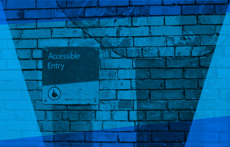
If the measure of a society’s humanity is the way it treats its most vulnerable, then a key measure of a website’s success is its accessibility.
It should, of course, go without saying that a website should be accessible to all users, including those with disabilities. Apart from anything else, it seems manifestly ridiculous to exclude such a large proportion of potential users from your website: some 16 million people in the UK are considered disabled - that’s one person in every four. That’s a lot of people to deny the full use of your website.
If the moral imperative to make your website accessible isn’t enough, there’s also a legal requirement: the Disability Discrimination Act (1995) and the Equality Act (2010) require that service providers take “reasonable steps” to provide an equal experience and to prevent discrimination by failing to provide an equal experience. The UK Equality and Human Rights Commission (EHRC) goes even further: websites are services and it is no longer enough not to discriminate and businesses need to proactively provide for the disabled to be able to use their website.
"If the measure of a society’s humanity is the way it treats its most vulnerable, then a key measure of a website’s success is its accessibility"
The persistent image of disability is a wheelchair, but disabilities come in many forms: visual impairment, motor difficulties, cognitive impairment or learning difficulties, deafness or impaired hearing. Website accessibility should take into account all of these.
The Web Content Accessibility Guidelines (WCAG) lays out the criteria websites need to meet in order to be legally compliant:
Perceivable: users must be able to recognise and use the website with the senses that are available to them. Information and user interface components must be presentable to users in ways that they can perceive; content must not exclude people with (for example) vision and hearing disabilities. This may include things like text alternatives (alt text) on images, transcripts for any media used, a logical structure to the content, not using images of text, not using colour as the only way of distinguishing something, etc.
Operable: websites must be responsive and easy to navigate for all users across multiple browsers and mobile devices; the interface cannot require interaction that a user cannot perform (e.g. if they are not using a mouse). This means considering keyboard only users, using descriptive titles for pages and frames, letting users play, pause and stop any moving content, using descriptive links so users will know where clicking it will take them, etc.
Understandable: websites should be organised in a way that makes them easy to use and should use language that most users will understand. This means making it clear what language the content is written in and indicating clearly if this changes; features should look consistent and behave in predictable ways; form fields should have visible and meaningful labels and it should be easy to find and correct errors in form.s
Robust: websites should be robust enough to integrate with a wide variety of user agents, including assistive technology. This means things like using HTML so user agents (including assistive technologies like screen readers) can accurately interpret and parse content, making sure that the code allows assistive technologies know what every interface component is for, what state it’s currently in and if that changes.
Learn more about the Web Content Accessibility Guidelines
Of course, a more usable website will benefit all users, not just those with a disability. In addition, an accessible website will also offer improved Search Engine Optimisation (SEO), improving the quality and quantity of traffic to the website. There is a significant overlap between those features that improve accessibility and those that improve SEO: meaningful page titles, better tagging, headings, descriptive links, text equivalents for images, transcripts, consistent navigation - all of these will make the pages more accessible to everyone but also boost their searchability.
There are lots of good reasons for making sure that your website is accessible. Surely none of those reasons are more important than the simple imperative to make your website as easy to access as possible for as many users as possible, regardless of circumstances or abilities. Anything else should be considered a bonus. After all, what kind of a society do we want to live in?
Are you worried about the accessibility of your website? Housing Online are here to help you. We have the expertise earned through many years of experience that enables us to offer a comprehensive service for your website, from design all the way through to implementation.
Read “Accessibility Matters”, our last blogpost on website accessibility.
Contact us on info@housing-online.com to find out how we can help you.
Photo by Daniel Ali on Unsplash
About Housing Online
Housing Online design and build digital solutions for Housing Associations across the UK and beyond. Our My Home Tenant Portal is live in 30 organisations across Scotland, Northern Ireland and England, many with fully integrated websites designed and developed by our team. In April 2021, in collaboration with seven Scottish Housing Associations, we successfully launched These Homes, a Choice Based Lettings web solution.
